For June, the Artists Synchroblog task was to find inspiration via Pinterest. Pinterest is a hugely popular online bulletin board, that lets you “pin” links and images for later reference. I used to use it quite a lot, but scaled back after concerns about copyright infringements surfaced last year.
Those concerns aside, it is a very useful tool for collecting ideas and inspirations. With a studio renovation underway, I’ve been bookmarking links like crazy for working effectively in small spaces.
One of the things I need to be able to do is photograph my work.
After investing in a good DSLR last year, I discovered one very annoying downside: it didn’t work with the light tent I’ve been using for the last seven years. My DIY setup of a food umbrella and a white pillow case worked perfectly well when I was using a portable digital camera. Most of the photos for my tutorials were shot using that setup. Unfortunately though, with the DSLR, I needed to position the camera further from the subject, and the awkward angles resulted in ugly photos. One of the links I found last year was a portable light tent by Modahaus. Much of the Modahaus system is actually intended for use with iPhone type cameras. The Tabletop Studio TS216 is slightly larger than a legal size file folder, which makes it portable and easy to store when not in use. What really attracted me to it were the background sweeps. I’ve used all kinds of things for backgrounds, from matte board to scrapbooking paper, and most recently plastic cutting boards. All have some degree of texturing, which is fine, if all I’m doing is taking Etsy shots. Jury photos need to be on a dark background, de rigueur, and magazine photos work best on white.
Most of the other light tents I’d seen used fabric sweeps, which tend to be wrinkly. The Modahaus sweeps are made of plastic, and come in black, grey, white, translucent white, red and blue.
The TS216 turns out to be a bit small for my needs. I find that I have to add risers to the diffuser to make space for my props.

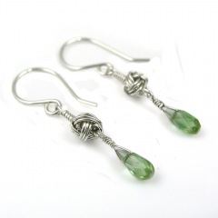
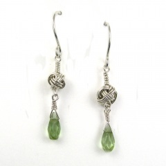
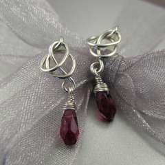
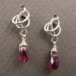
So far, I’ve been quite pleased with the results I’ve gotten, but there is the inevitable learning curve of figuring out how to position the lights on the jewellery to avoid excess glare or shadows. I like the little bit of reflection I get with the black sweep and as long as I take care to minimize dust, there is less photo editing needed than my old setup.
I’m constantly experimenting with different tricks, and while taking these shots, I added a small light bounce card to reflect a bit of the light to the underside of the rings. It made a huge impact.

I’ll continue tweaking the setup over the coming months, but on the whole this was a very worthwhile investment, found via Pinterest!
The Artists Synchroblog is a group of bloggers who post every other month on the same topic, sharing our experience or perspective. On alternate months we undertake a Pinterest Project where we each take inspiration from a Pinterest picture, create something (art, a meal, a DIY project, etc) and then post about it. You can read more about the Artists Synchroblog here.
Please visit the other synchrobloggers this month and see how Pinterest inspired them:
http://amyestellemetalworks.blogspot.com
http://www.islandgirlsinsights.blogspot.ca/
www.elenorbuffington.blogspot.com
http://doxallodesigns.blogspot.com
http://lesliervillarreal.blogspot.com
http://www.journeyinjewelry.com/blog/My-Journey-in-Jewelry
http://simpledesignjewelry.blogspot.com
http://designsbylynnea.blogspot.com/
http://design.kcjewelbox.com
www.allwiredupjewelrydesigns.blogspot.com
http://shaktipajdesigns.com/blog/
http://stonezjewelry.com/blog/


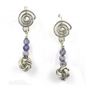
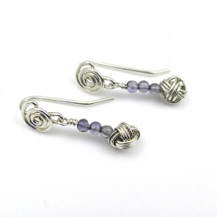
 Custom & bespoke designer #diannekargbaron #wearjewelryyoulove #wsstudiotour


