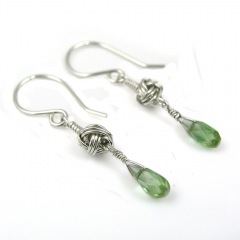
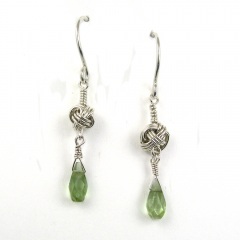
YOJ10-15 Knotted Earrings 3

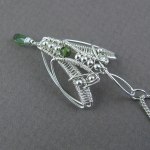
Knotted Earrings 3 (2010)
Sterling silver, fine silver, tourmaline
Constructed, cold-joined
L 3.7 cm x W 0.5 cm (W 1.45″ x L 0.2″)

Continuing on from last week, since I made several of the Monkey’s Fist knots, I made another pair of earrings!

I’ve been doing some experimenting with photography lately, putting my pieces on a white background instead of the medium gray.  I’m looking for ways to make the images “pop” more – in my recent work I’ve been using a lot of stones that have the same value as the background, and it makes the jewellery look dull.  “Value” in colour terms refers to how light or dark it is.  (To see check the value of your stone, stare at the photo with squinted eyes – if the stone disappears it has the same value as the background.)  In order for a photo to have visual interest, it has to be either lighter or darker than the background, otherwise the eyes see what’s there, but the brain registers “ho hum”.

It’s a bit more work to deal with a white background – inevitably, and even though I have a white balance setting on my camera – the raw photo comes out slightly grey.  Photoshop can adjust the balance it easily, but then I usually still have to do some extra clean up.  It’s a bit tricky to lighten the background enough to get rid of “noise” but not so much that the jewellery bleaches out.

From a print perspective, (putting on my editor hat for a moment), getting photos with white background is a godsend for layout.  I can plunk them down anywhere on a page and build text around them.  Or I can crop and put several images close together – something that isn’t possible when the jewellery is shot on a grey or staged background.   There are no distractions – you look at the jewellery and nothing else.

While they work for print and web, white backgrounds do *not* work well for jury photos.  I had the opportunity to sit in on a jury for a show recently (something I highly recommend BTW, it’s very educational), and I noticed that the photos with white backgrounds were always very jarring.  Backgrounds with a value of medium to dark (but not black) and *absolutely no props* worked best for jury photos.  Prop shots work well for Etsy, but are distracting in jury.

More photos:

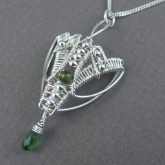
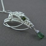
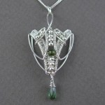
YOJ10-03 Marquise Series: Pendant 8

Marquise Series:  Pendant 8 (2010)
Sterling silver, fine silver, tourmaline
Constructed, cold-joined, woven
L 5.0 cm x W 2.25 cm x D 1.0 cm
(Update: SOLD June 2013)

One of my new year’s resolutions was to start using a Job Jar.  My family and friends, who know me very well, know that I’m hopeless about housework.  I think it was Erma Bombeck who said “Nature can’t abhor a vacuum as much as I do.”  That kind of sums up my attitude nicely.

However, I do live with three other (messy) people, so some token effort to maintain order must be made.  So… enter the Job Jar.  I wrote all the various chores on the little slips of paper, and included some fun things, and every day I pick one out of the jar.  The choice is completely random, although I like to think of it as leaving it up to God/the Universe to pick the task that is right for me on any particular day.  Some days I have more energy than others, and interestingly enough, each task so far has been perfect for the day it was chosen.  I do my Job Jar job early in the day, and then the rest of the day is mine to do as I please.

The net result of doing my housework this way is that I’m being much more productive with my jewellery making as well.  So, I feel good because my house is slowly getting cleaner, and I’m getting to work guilt-free on something I love every day.  Bonus!

The studio gremlins paid a me a visit this week and stole this piece for a few hours.  I noticed it was missing after my husband had done a sweep through the house collecting detritus to put out in the garbage on Monday night.  He tends to be somewhat brisk and indiscriminate when he does this.  A frantic search turned up nothing, and I was resigned to it having disappeared into the mass of trash.  On Tuesday, my job from the Jar was “Clean the livingroom.”  It was like a bunch of angels were standing around saying “We want to help you”.  LOL

So, I set to work, cleaning, sweeping and reorganizing the room.  When I picked up and moved one of the toy boxes, lo and behold, there was the pendant!  With a quick prayer of thanks, I put it in a safe location, where I knew I’d find it again.

Like the previous pieces in the series, the pendant is formed using a marquise shape.  When I was first shaped the wire, I thought the pendant looked like a moth.  The form evoked a very strong Art Nouveau influence.  As I added the weaving and the beads, the moth form persisted, and I noticed that the pendant was starting to look like Rainbow Wrapping.

Originally, I was going to hang the pendant the other way around, from the point.  It reminded me of the Star Trek logo.  I didn’t like how the tourmaline drop looked hanging from the long tail though – it threw off the balance.  So the drop was moved to the point, and the tail became the hanging point.

While photographing the piece today, I started seeing the form of an elephant face.   How cool!  I don’t remember ever seeing so many different influences in one piece.

What do you see?  Let me know!

More photos:

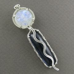
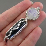
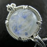
YOJ09-35 Moonrise

Moonrise (2009)
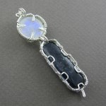
Pendant, Sterling silver, fine silver, rainbow moonstone, indicolite (blue) tourmaline
Constructed, cold joined
L 6.4 cm x W 1.8 cm x D 1.2 cm (widest point)
SOLD to a private collector, September 2010

On my annual trek to Bancroft this year, I decided to focus on buying cabachons.  I have a huge stash of beads, but I’ve been moving away from working with them.  The last time I was in Bancroft, I bought some really nice cabs from one particular vendor, and was really happy to see them again.  This year, I scored a bunch of beautiful tourmaline, prehnite, kyanite, garnet and rainbow moonstone.

As a member of the Etsy Wire Artisans Guild, I’m supposed to make a monthly “theme” piece.  Well… I’ve been a bit lax about it because of my other commitments.  So I’m playing a bit of catch up.

It’s been a couple of years since my last attempt at a multi-stone pendant.  That attempt was… adequate… but really not up to the standard I like to set for myself.  So, for the EWAG’s “Blue Moon” theme, I decided I’d take another stab at it.

Back when I was single, I lived within walking distance of Woodbine Beach in Toronto, and would regularly stroll along the water’s edge.  I always loved watching moonrise over the water.  The reflected light from Luna rippling over the waves was so peaceful.  The Moon is the ruler of my astrological sign, Cancer, so I feel a special connection with it.  With my feet in the water, I would say prayers of thanks to the Creator for all of the blessings in my life, and listen for the messages in my heart of what direction I needed to go.

For quite a long time now, I’ve been getting messages telling me I need to reconnect my spiritual side with my jewellery.  I feel really strongly that doing that is going to resonate with others.  So, in the past few months, I’ve been making and posting work that draws from my inner life.

I gave conscious thought to the stones I chose for this piece.    The calming, balancing energy of the 11.7 ct moonstone helps connect with intuitive promptings, and the loving, powerful energy of the 24.42 ct blue tourmaline helps bring awareness and communication of those messages.

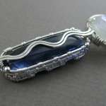
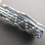
The wavy line coming down from the moon was always part of the design, but I also wanted to incorporate the shimmering and rippling of the water by incorporating weaving into the bezel of the lower stone.  I’m very happy with the way it turned out, and the energy that comes off the piece is wonderful.

[mp:id=5]
.
.
Other views: